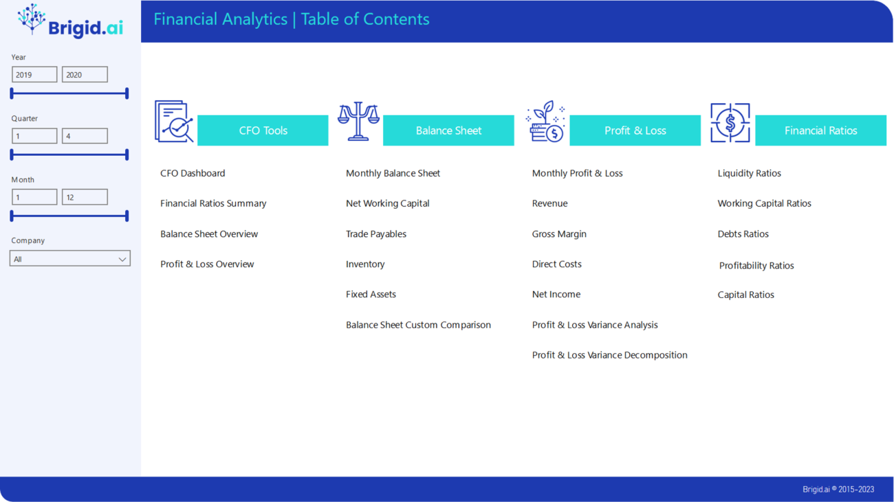
We offer easy-to-use analytical reporting solution based on Microsoft Power BI that makes all your financial data visual and transparent. It can be used as a tool for investigation and analysis, as well as a beautiful and understandable set of reports that can be presented to senior management or the Board of directors. These reports help both financial professionals and company management always have a clear understanding of the financial performance and market position of the organization, tracking the main trends, market factors and strategic position.
As you know, you can not manage what is not measured. With our financial dashboard, you will always have clear operational information and be able to make quick decisions, improving organizational results.
Balance Sheet
Review your balance sheet in total and compared to a chosen period. Easily visualise trends at a line item and dimensional level to guide further investigation or corrective action. A second report page presents the same data by month, helping you to observe the values in you balance sheet as they move across periods to better compare trends over time across all line items in unison, and to see whether movements in one line impact another.
Net Working Capital
Understand the detail of your net working capital position – the mix of assets and liabilities and the more detailed components – click to see trends by dimension and within components to identify what might be driving levels too high or too low.
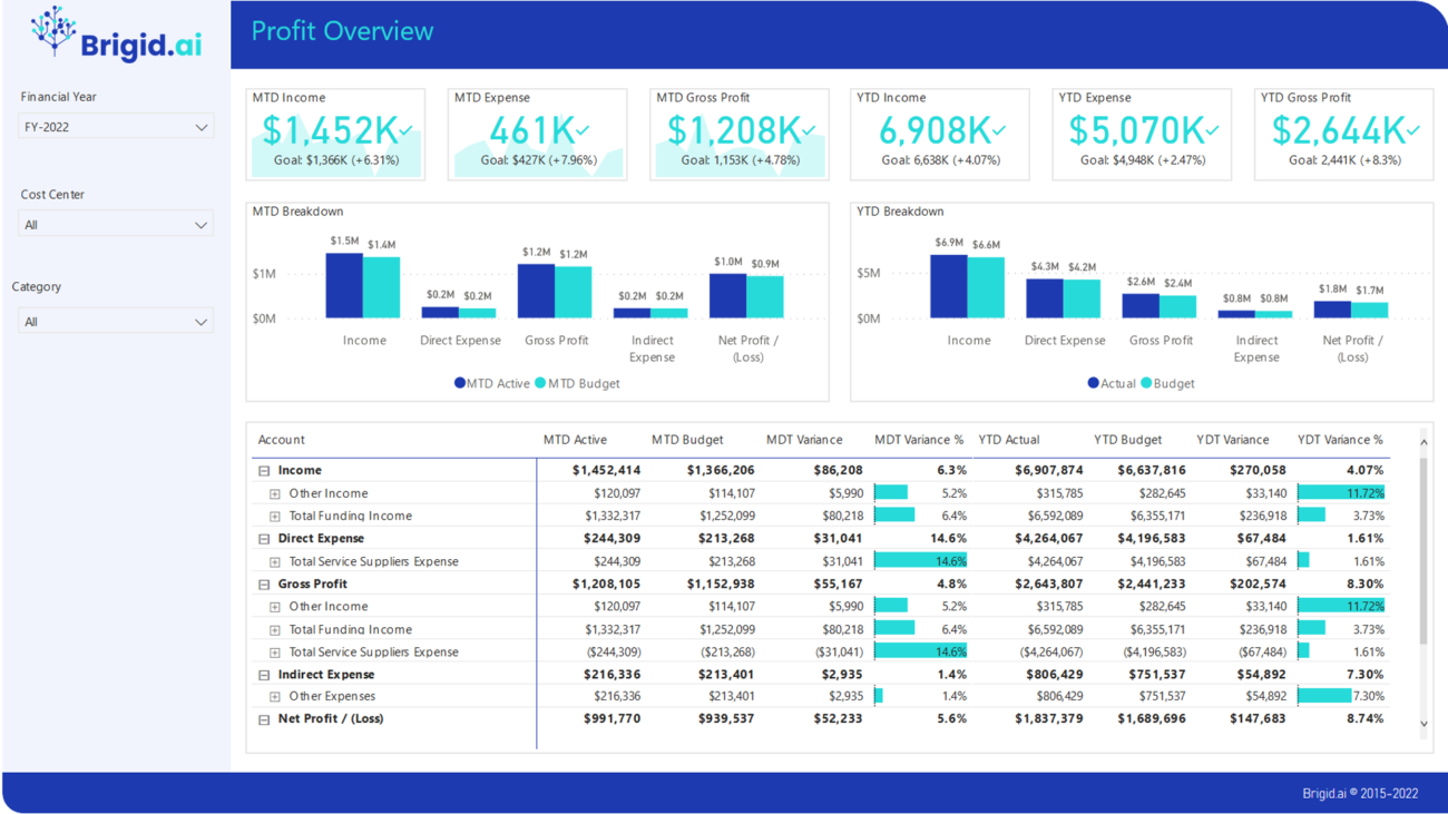
Profit & Loss
Review your P&L in total and compared to a chosen period. Easily visualise trends at a line item and dimensional level to guide further investigation or corrective action. A second report page presents the same data by month, helping you to observe the values in your P&L as they move across periods to better compare trends over time across all line items in unison, and to see whether movements in one line impact another.
Ratios
Get an overarching view of the financial health and trends in your business based on a broad set of standard financial ratios. Use slicers to filter for different periods, and to cut your data based on your existing financial dimensions.
Monitor the liquidity trends in your business to ensure you have sufficient assets to meet your immediate short term debt requirements.
Monitor the working capital trends in your business to ensure your inventory is under control, that you’re maximising your creditor terms, and collecting cash from customers.
Monitor your level of debt in the balance sheet, see debt relative to your earnings and ability to cover interest costs.
Monitor trends in your core profitability results, relative to your revenue, to ensure you manage profit drivers before they become issues.
Monitor the trends in the capital structure and performance of your business – how hard your assets are working for you and your returns on investment.
Our prebuilt Power BI packages help HR professionals to start get insights from the data they have in minutes, not weeks. Visualisations make data clear and transparent and make data-driven decisions. Data-driven decisions help to improve ROI by attracting, managing, and retaining employees.
Data-driven decisions of HR professionals based on Power BI analytics also help to maximise productivity, make working environments better and employees more engaged.
Demography
This dashboard contains headcount and geographical analysis of employees from the point of view of each different business units.
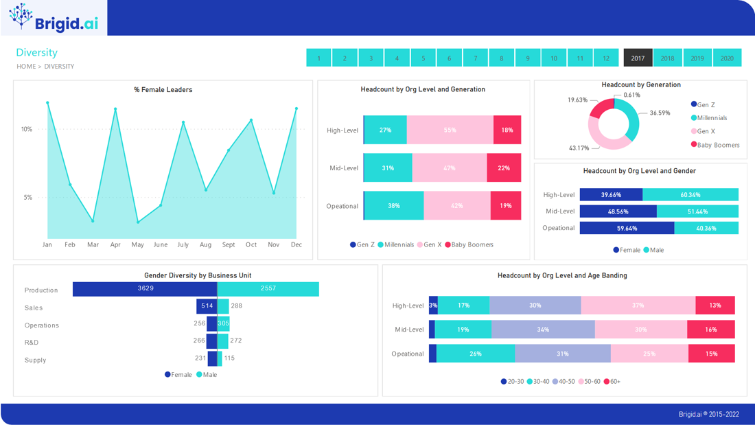
Diversity
Using an interactive dashboard, HR professionals can dig deeper into demographic data and analyse one variable, such as ethnic diversity. This dashboard shows the different metrics on the diversity of the company like women in senior level positions, number of employees by generation, etc.
Historical & Trends
Historical & Trends dashboards help HR teams and business managers understand the trend analysis of employees, hires, terminations, attrition.
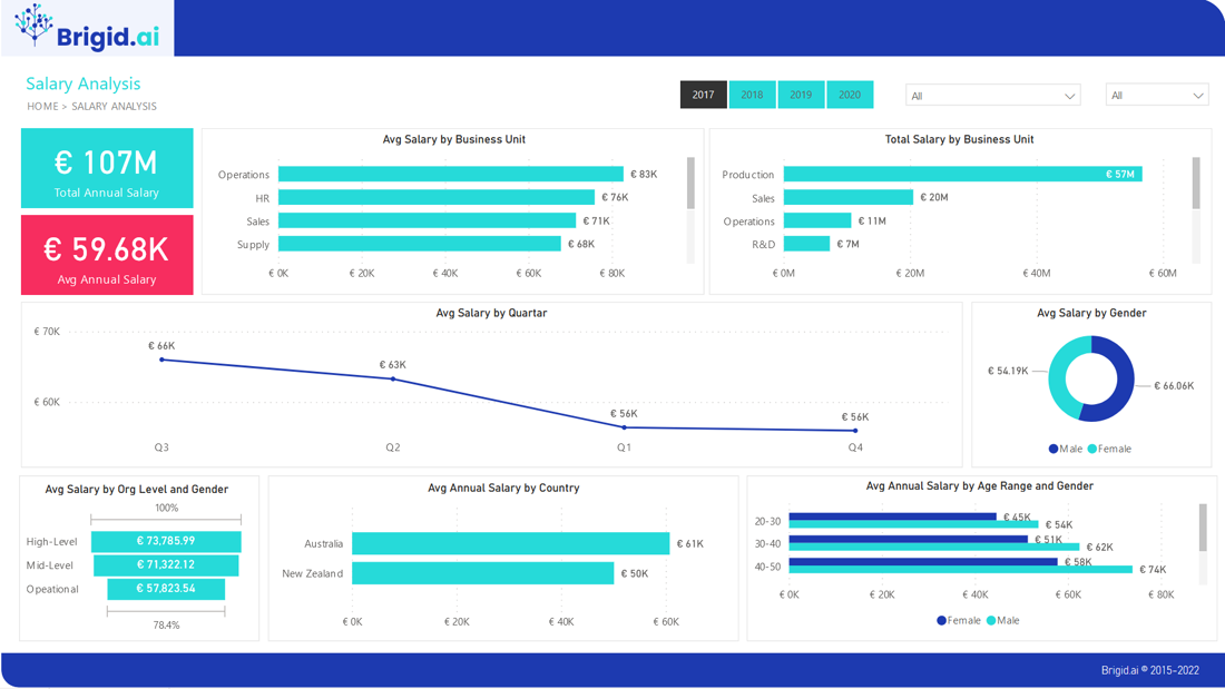
Salary Analysis
It contains an average salary analysis in different categories. For example, business unit, month, gender, age range, seniority, location.
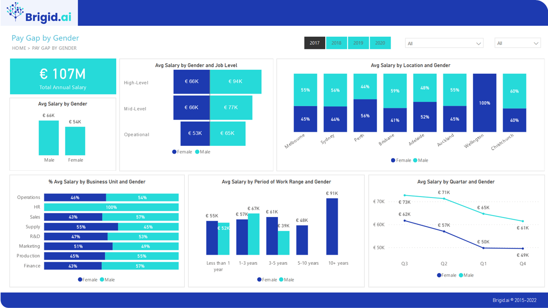
Gender Pay Gap
The Gender Pay Gap refers to the difference in the average hourly pay of women compared to men in a particular organisation and is designed to capture the extent to which women are evenly represented across an organisation. Employers need to be aware that where a gender pay gap exists, this may negatively impact their brand, employee relations, public reputation and their ability to attract and retain talent.
Training
Employees are the most important asset within an organization. This HR dashboard contains an analysis of training and the cost in different categories. For example, department and training type.
Modern organisations pay more and more attention to Diversity and Inclusion. This is not only important from the point of the compliance, but also as a means to send a clear signal of commitment to Diversity and Inclusion to employees.
Our prebuilt Power BI packages for Diversity and Inclusion reporting and communication will make this signal clear and powerful.
Demography
This dashboard contains headcount and geographical analysis of employees from the point of view of each different business units.
Diversity
Using an interactive dashboard, HR professionals can dig deeper into demographic data and analyse one variable, such as ethnic diversity. This dashboard shows the different metrics on the diversity of the company like women in senior level positions, number of employees by generation, etc.
Salary Analysis
It contains an average salary analysis in different categories. For example, business unit, month, gender, age range, seniority, location.
Gender Pay Gap
The Gender Pay Gap refers to the difference in the average hourly pay of women compared to men in a particular organisation and is designed to capture the extent to which women are evenly represented across an organisation. Employers need to be aware that where a gender pay gap exists, this may negatively impact their brand, employee relations, public reputation and their ability to attract and retain talent.
Our prebuilt Compensation & Benefits packages help HR professionals to dig deep into the data of salaries and benefits of all categories of employees. For most companies, salaries are the largest expense and having a clear understanding of it is vital in taking any decision.
Compensation & Benefits Dashboards based on Microsoft Power BI equip HR professionals with actionable insights to contribute the success of your organisation.
Review your Profit & Loss in total and compared to a chosen period. Easily visualise trends at a line item and dimensional level to guide further investigation or corrective action. Report presents the same data by month, helping you to observe the values in your P&L as they move across periods to better compare trends over time across all line items in unison, and to see whether movements in one line impact another.
For P&L you can separately explore the detail of revenue, margins, operating expenditure and profit, with the ability to switch to a ‘% of revenue’ view with a simple slicer selection
Profit & Loss packages based on Microsoft Power BI equip managers and other stakeholders with intuitive and easy-to-use tools foe decision-making.
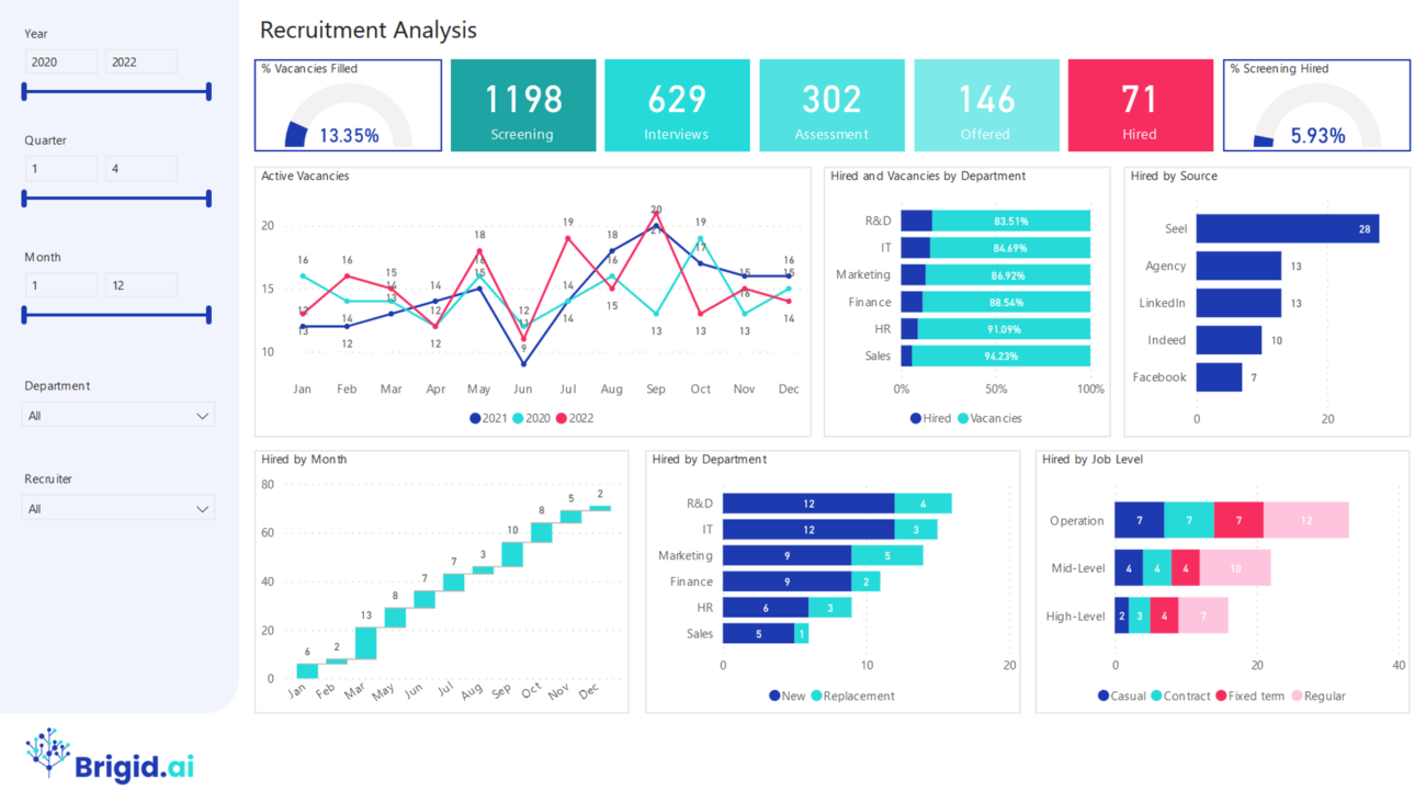
Get a complete view of your recruiting analytics with Recruitment Dashboard. See metrics like active vacancies, roles filled, search method that was the most/lowest, and number of interviews completed. Filter by variables such as departments, recruiters, and dates.
Our prebuilt Recruitment Dashboard helps HR professionals in recruitment to get quick insights and make data-driven decisions.
Learning & Development is one of the most important HR functions in any organisation. It is crucial to have insights on how people learn and what skills and competencies are developed over time and how this impacts the bottom line. Our prebuilt Power BI packages for Learning & Development will help HR professionals in your organisation communicate the results of their work clearly and effectively.
The purpose of this end-to-end analytics and reporting solution – built on Microsoft Power BI – is to help organizations discover useful HR insights for strategic decision making.
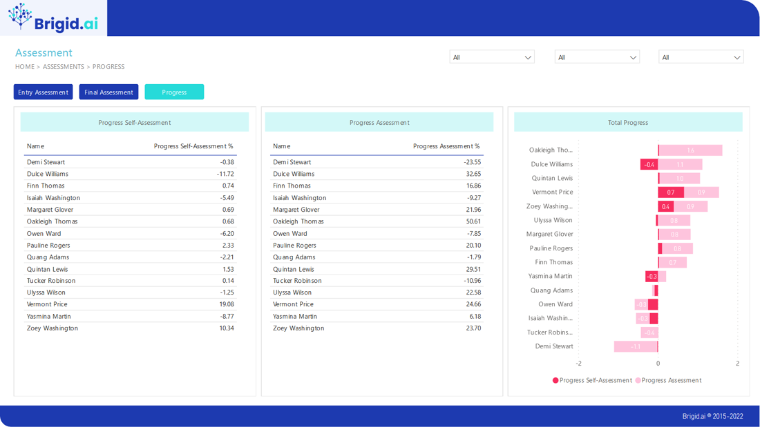
Progress in L&D
If your organisation has a L&D process in place and you don’t know what happens inside and can’t measure it, you are as one of the Mark Twain’s characters cracking nuts with the Royal Seal. HR analytics in L&D can help you measure increase in competencies in different departments of your organisations and identify how different factors like training, coaching and motivation contribute to achieving business results.
Leadership potential
According to Gallup research, only 10% of employees can be managers. L&D analytics can help you to measure value added by the HR function. To identify high-potentials, you don’t need to start a new initiative. The leadership potential rating is calculated automatically.
Managerial coaching
In corporate environment, learning transfer is not the most important aspect of L&D process. Our reports help managers become better coaches.
Learning impact
According to the new CIPD profession map HR professionals should measure and demonstrate value they deliver – it is considered as one of their main competencies. L&D analytics can help you to measure value added by the HR function.
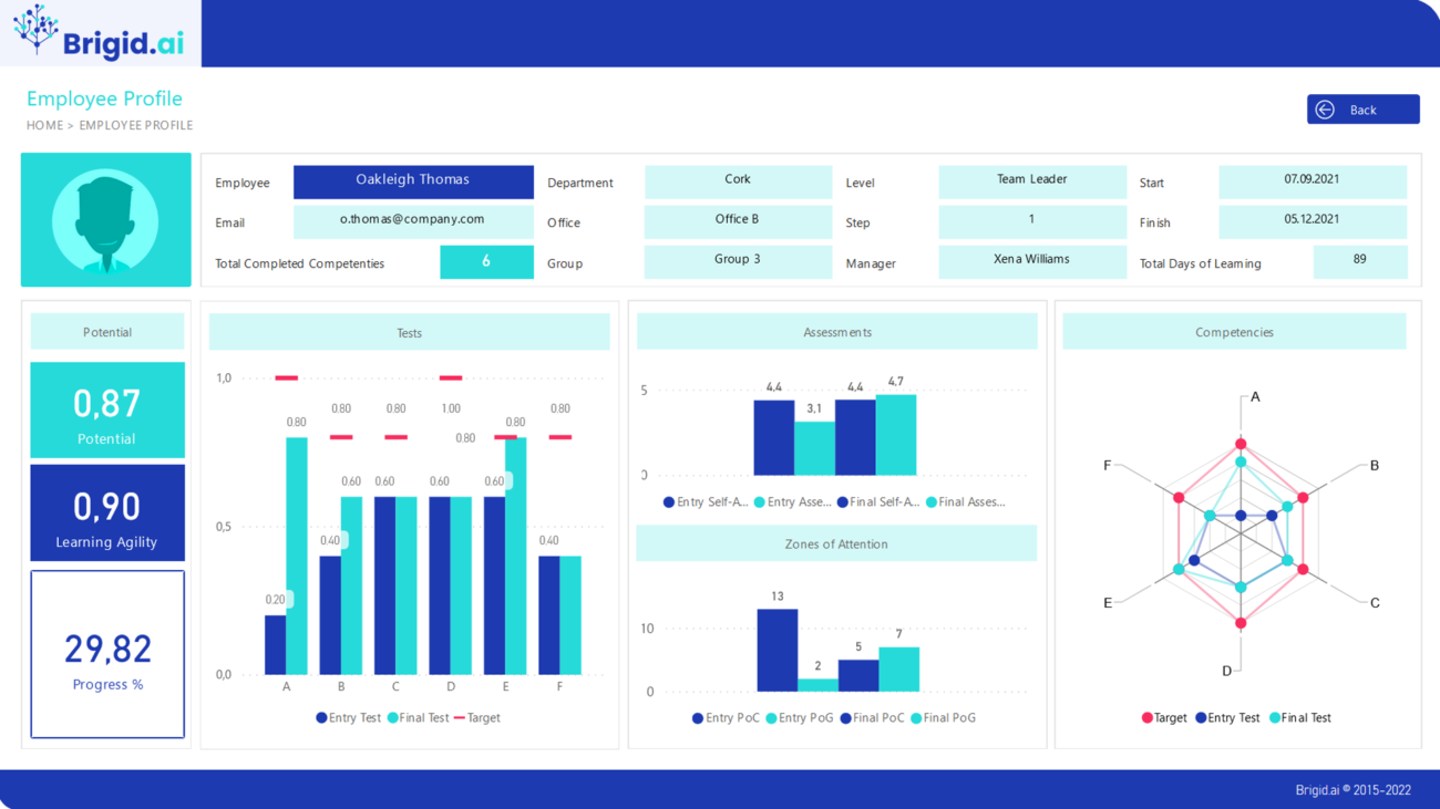
Employee profile
Increase in leadership competencies in organisation is the sum of individual learning results of employees in leadership training. It is important to have insights on how every individual employee learns to provide support and coaching for those who need it.
The metric Turnover Rate means employees who left the organization, either voluntarily or involuntarily, as a percentage of headcount. This metric is crucial to understand all aspects of the talent cycle within your organization. Many organisations use this metric in isolation, for example it can indicate that the retention processes of the business are not working. On its own, it may indicate that the retention processes of the business are not working.
Our prebuilt Power BI packages for Turnover Rate will help HR professionals in your organisation better understand why people leave and actions to prevent it.
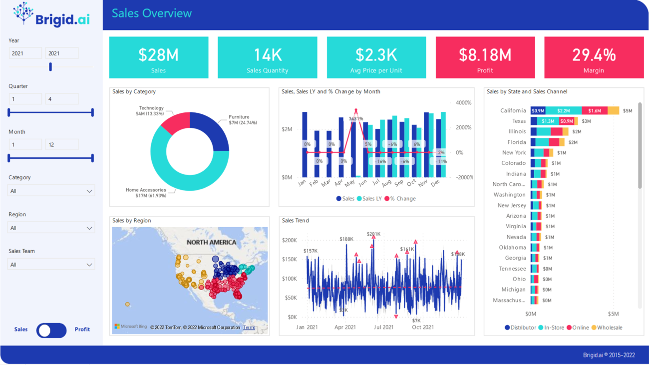
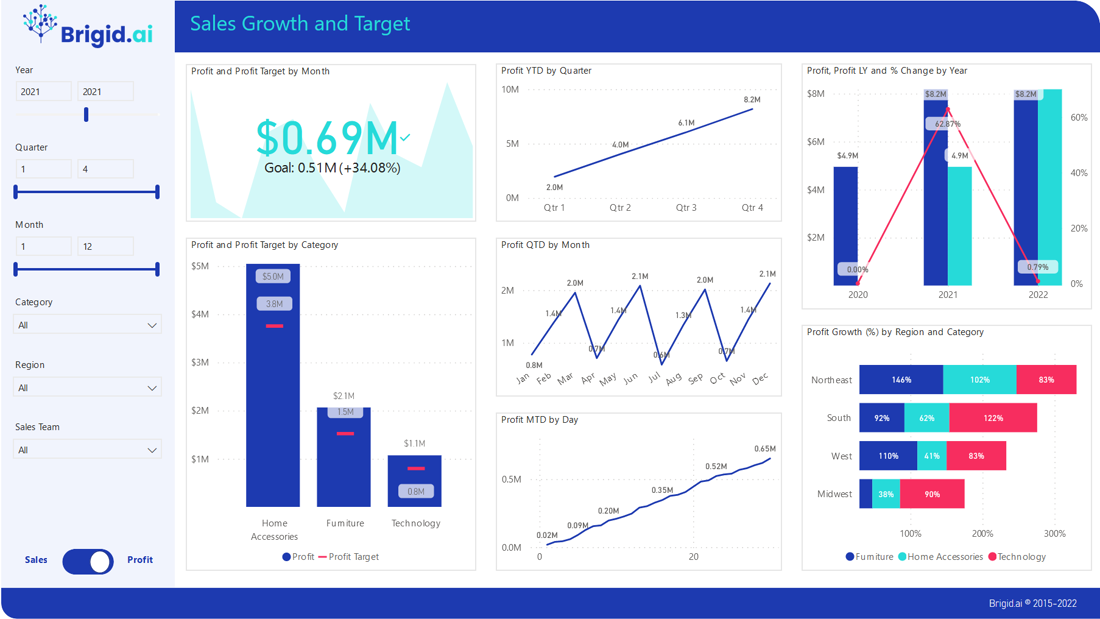
Winning new business is of utter importance in any economic situation and for any organisation. Our Sales Dashboards based on Microsoft Power BI can help you to accelerate analysis and make decision-making data driven.
You will have a detailed view of your pipeline and opportunities – all visual and actionable.
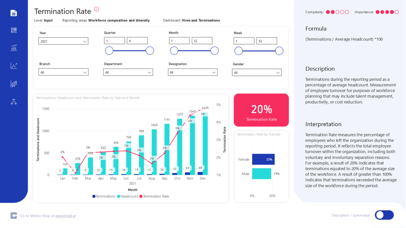
Terminations during the reporting period as a percentage of average headcount. Measurement of employee turnover for purposes of workforce planning that may include talent management, productivity, or cost reduction.
Termination Rate measures the percentage of employees who left the organization during the reporting period. It reflects the total employee turnover within the organization, including both voluntary and involuntary separation reasons. For example, a result of 20% indicates that terminations equated to 20% of the average size of the workforce. A result of greater than 100% indicates that terminations exceeded the average size of the workforce during the period.
The metric is key for calculating major indicators of recruitment, staffing effectiveness and turnover/retention.